Interior decorating can be so much fun! However, selecting colors that work well together and look fresh and up-to-date is sometimes daunting. The Pantone Color Institute experts have curated ten comforting yet vibrant and energizing colors. Pair these colors with their five suggested neutrals to make the color selection process a success. Referencing these color trends is an easy way to choose colors that work in your home and reflect your personality. No need to reinvent the color wheel – we can help you select from these latest trends to update or accent your space. Heading into the colder, slower months of winter may be the perfect time to focus on a project that will uplift and energize both your spirits & your home.
A Comforting Home Center
It seems that 2020 has kept many of us at home much more than we prefer. If creating a comforting, cozy and calming space in your house is at the top of your wish list, try incorporating some of the upcoming color trends into your décor. This warm and inviting kitchen uses greens paired with warm wood tones to create a welcoming atmosphere.
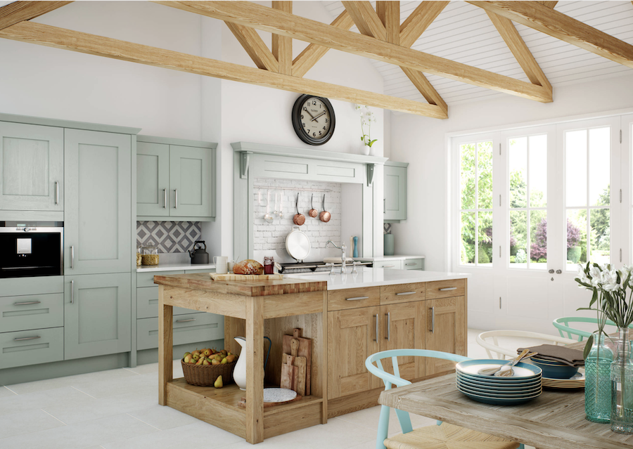
Green Ash, Ultimate Gray & Willow
Home Office takes Center Stage
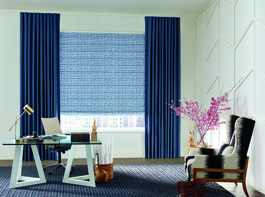
The year of the home office may have arrived! With more people working from home and many children learning remotely, this often neglected area has been receiving more design attention. A successful space fosters productivity and energizes those utilizing the work area. Your idea of what makes the best home office, and which colors inspire you and your family members to work most efficiently, are personal choices that only you can determine. The work space below uses bright and uplifting colors to create a unique environment that is nothing short of inspiring.
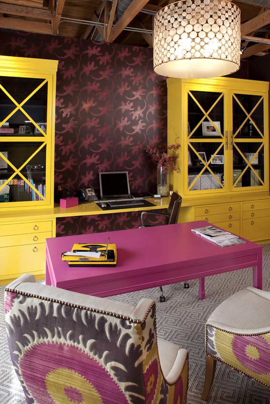
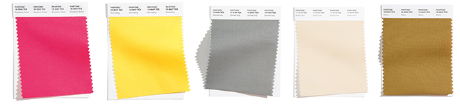
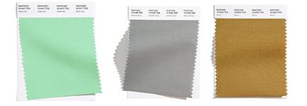
Raspberry Sorbet, Illuminating, Ultimate Gray, Buttercream, Willow
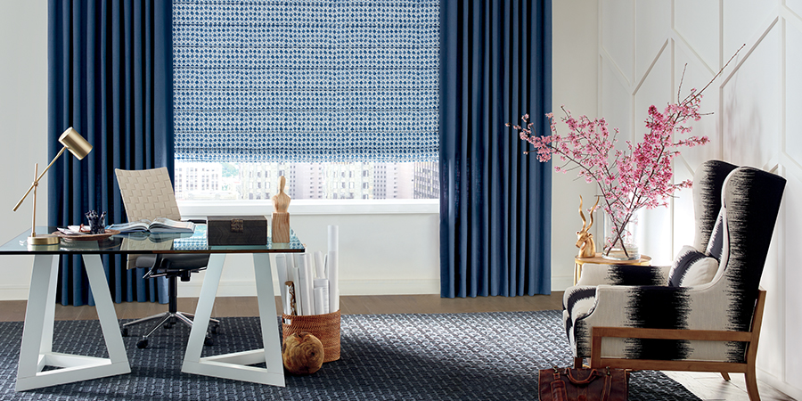
Maybe a Softer Approach?
If the above color combinations are too energizing for your space, consider incorporating some shades of blue. Blue is a relaxing and soothing color often used to cool a location. This season two blues appear on the color trend palette. As seen in the home office below, blue patterned roman shades are paired with solid dark blue drapery panels for a sophisticated style. To keep the room from looking dull, splashes of color, such as the pink stems in this picture, are incorporated.
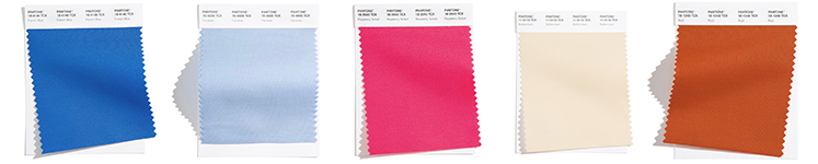
French Blue, Cerulean, Raspberry Sorbet, Buttercream & Rust
Intimate Home Gatherings
In-home get-togethers are on an upswing now that more restrictions are being placed on the size and location of gatherings with friends and family. It might be the perfect time to create an even more inviting dining space. A feature wall with a bright splash of color adds interest and appeal to this room. Paired with dark wooden accents and light colored walls, this dining room looks vibrant and updated.
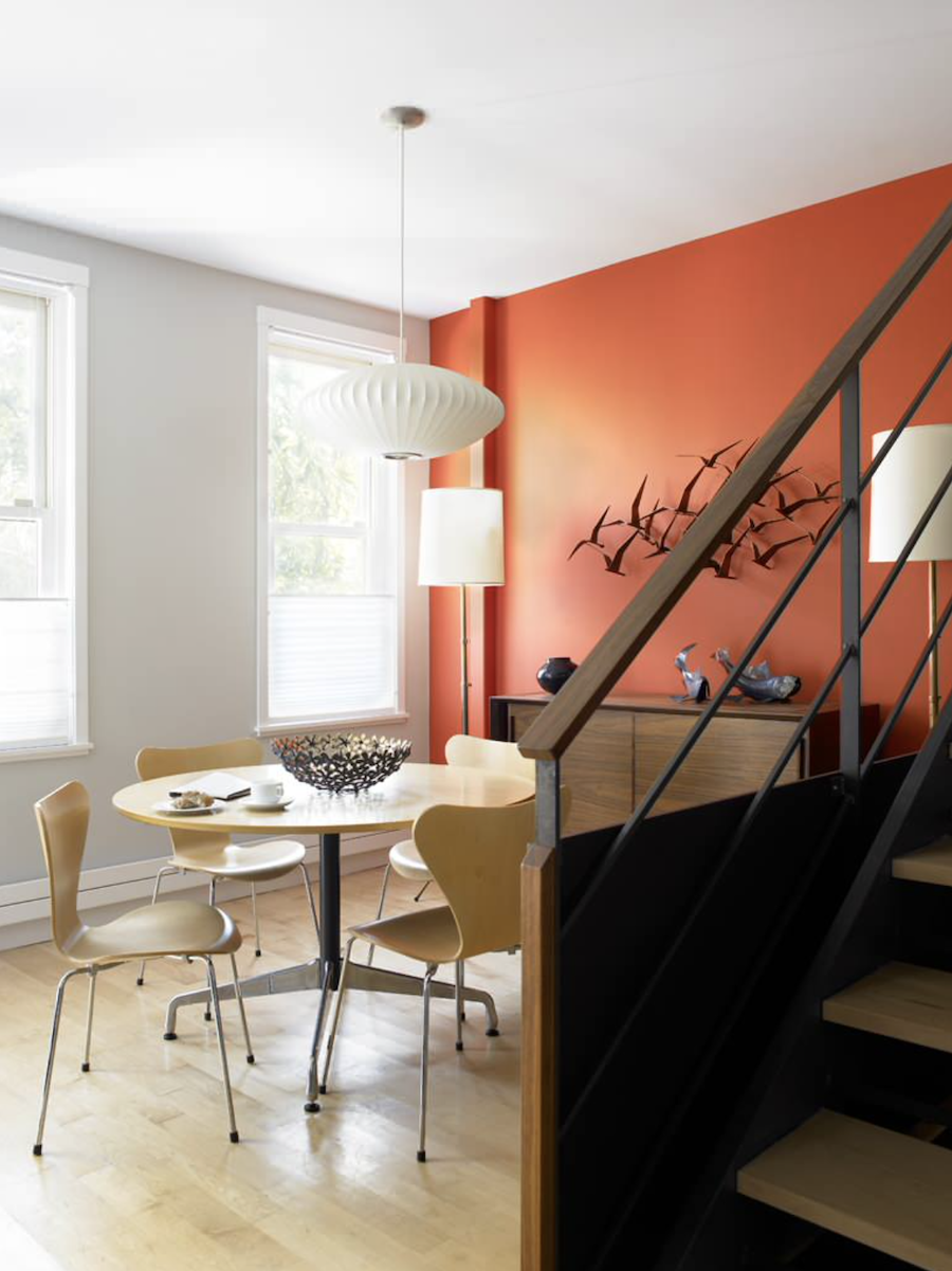
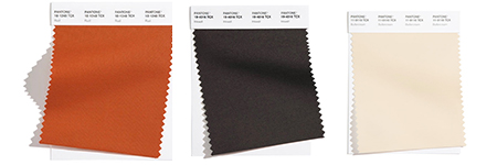
Rust, Inkwell & Buttercream
Ready to Add Color Trends?
This season’s color trends are exciting. Even if you already have a well-decorated home, adding some of these curated colors will freshen up your space. With so many well-coordinated colors from which to choose, remember to select ones that fit your personality and preferences. If you are looking to add the style or function of window treatments, like blinds, shades, shutters or draperies into your home, let us know! We’d love to listen to your plans and ideas so we can guide you to the fabrics and features that will best suit you and your family. Contact our team, at Aero Drapery & Blind, today.